Your CTA Has No Job

Some email buttons are incredibly confident for how little they actually say.
Learn More (learn more about what?)
Click Here (for what?)
Explore (where are we going?)
Discover (I am begging you to finish the sentence)
A CTA is supposed to move the reader forward, but a lot of emails treat the button like decoration... and that creates a bigger problem.
The email never clearly tells the customer what to do next.
Quick Summary
Every email should have a job. Track an order, finish setting up an account, book a call, complete a purchase, reply.
But when the CTA is vague, or there are five competing CTAs fighting for attention, the reader has to figure out the email's job for themselves.
That's not their job. It's ours.
The Email Fix
A CTA should answer one simple question: What happens when I click this?
That's why Track Your Order is usually stronger than Learn More, and Finish Setting Up Your Account is clearer than Continue.
The strongest CTAs usually describe an outcome. They tell the reader where the click leads or what they'll be able to do next, because the weak ones just announce that a button exists.
Where CTAs Go Wrong
There are usually two versions of this problem.
- The CTA is too vauge
- You get buttons like Learn More, Click Here, Explore, Discover, Read More. None of these are automatically bad, but the problem is that they rely heavily on the surrounding copy to explain what the button actually does. If someone is scanning quickly (which people do), the CTA should still make sense.
- The email has too many jobs
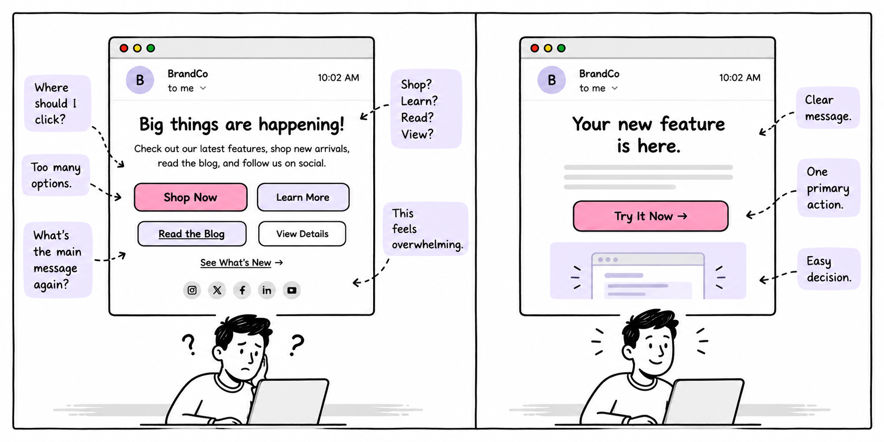
- This one is worse, because you open an email and see Shop Now, Read the Blog, Watch the Video, Follow Us. At this point, the email isn't guiding the reader, it's presenting a menu. Every extra action competes with the thing you actually wanted them to do.
The Button Test
Here's a quick test I like: Read the CTA without any of the surrounding copy.
Does it still make sense?
If the button says Track Your Order, you know exactly what's going to happen.
If it says Learn More, you need context.
That doesn't mean every CTA needs to be six words long, it just means the action should be clear enough that the reader doesn't have to decode it.
| Weak | Better |
| Learn More | See What Changed |
| Click Here | Track Your Package |
| Download | Get the QA Checklist |
| Continue | Finish Account Setup |
| Explore | View Available Plans |
The better versions reduce uncertainty, and reducing uncertainty is one of the simplest ways to make an email easier to act on.
One Email, One Primary Action
This doesn't mean an email can literally contain only one link.
You'll still have things like:
- Navigation links
- Help links
- Footer links
- Unsubscribe
- Secondary resources
But there should be one primary action, the thing the email exists to make happen.
If I ask "What's the one thing this email wants the reader to do?", you should be able to answer in one sentence.
If the answer is "Well, they can read the blog, check out the product, follow us on Instagram, watch the video, and maybe book a demo..." then you don't have a primary action. You have a buffet.
From The Lab
Before approving your next campaign, write this sentence: The job of this email is to get the reader to _____.
Fill in the blank.
If you can't do it quickly, the email probably isn't focused enough.
Then look at the CTA. Does the button describe that job?
If the job is: Get the reader to finish onboarding.
Then your CTA might be: Finish Setup
The Mini Experiment
Take one email you've sent recently. Now, temporarily delete every CTA except for the most important one.
Read the email again. Does the message become clearer? If yes, you probably had too many competing actions.
Then look at the remaining CTA and ask yourself: Could I make this button more specific?
Try replacing the generic verb with the outcome, because you may not need to rewrite the entire email.
The Takeaway
A CTA is not just a button, it's the moment where your email turns into an action.
So, don't make the reader guess. Give the email one primary job and make the CTA describe that job.
And remember:
If you can't explain what the email wants the reader to do, the reader probably can't either.
On Thursday, we'll take this one step further and look at how to structure an entire email around one primary action, without stripping out every secondary link or making the message feel robotic. The goal isn't fewer buttons for the sake of fewer buttons. It's a clearer path forward.
Need Help Fixing Your Email System?
Plotnicki helps teams sharpen campaigns, lifecycle flows, newsletters and customer journeys so every email has a clear purpose.
If your emails are doing too much, let's fix that.